

At a glance
Overview
One of the initiatives of Air India’s digital transformation was to create a singular platform combining 156 internal tools used by employees of various roles, from non-flying staff to pilots and attendants.
Problem
A new internal tool portal was in development with no design system or guidelines. As the team scaled, inconsistent patterns multiplied across features and files, creating rework and a fragmented user experience.
Solution
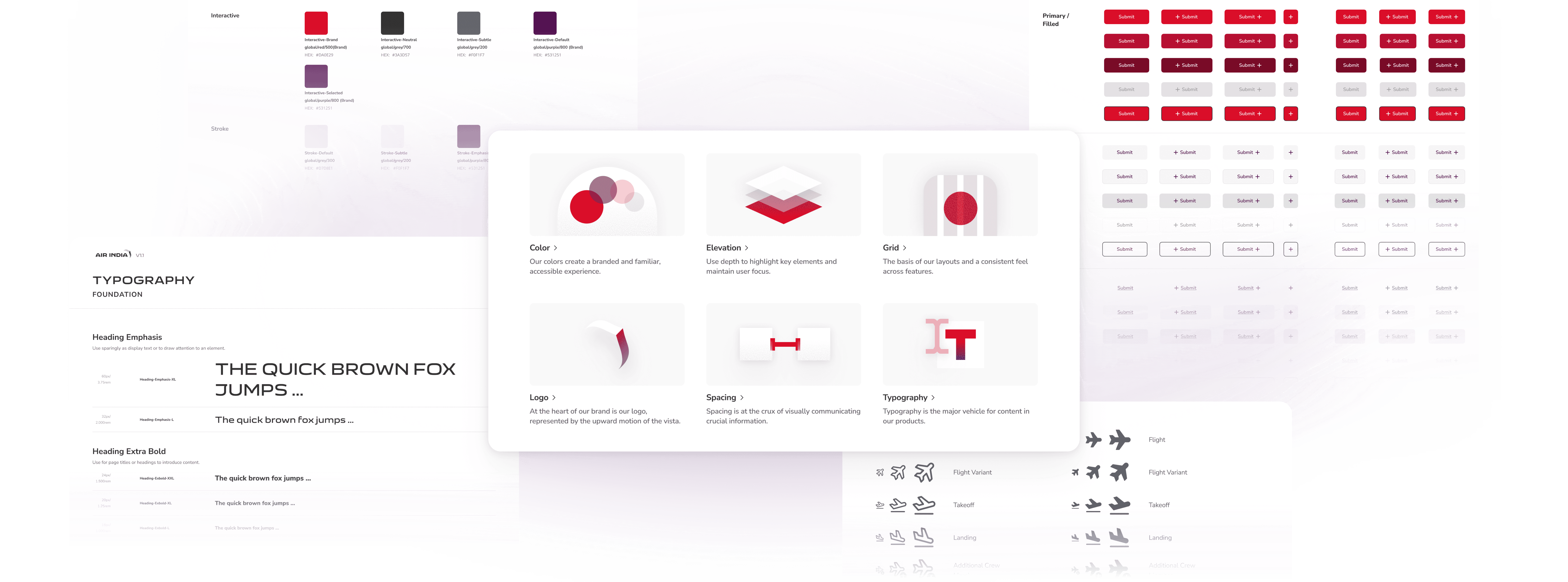
I co-led the creation of a Figma design library from the ground up: semantic color foundations, 100+ components with usage documentation, and a structured adoption process that supported 9+ designers across time zones.
Impact
100+
components built
60%
faster design execution
9
designers on the team
Challenge
How might we build a design system for a growing design team, without slowing down a product that’s already shipping?
Context
Designing without a centralized system

The design team was scaling faster than the system could keep up.
The portal was being built with no centralized design system or guidelines. As the team scaled and shipped in parallel, UI patterns diverged quickly across files and features.
Pain Point
Inconsistent designs, no library
Without a shared component library or clear rules, the same UI problems were solved in different ways across files, creating inconsistency for users and rework for the team.
Pain Point
Building while shipping
My teammate and I had to develop the system while also designing and shipping product work, planning releases so the team could adopt changes without slowing down.
Process highlights
Building a color palette
We began with foundations that would unblock day-to-day work.
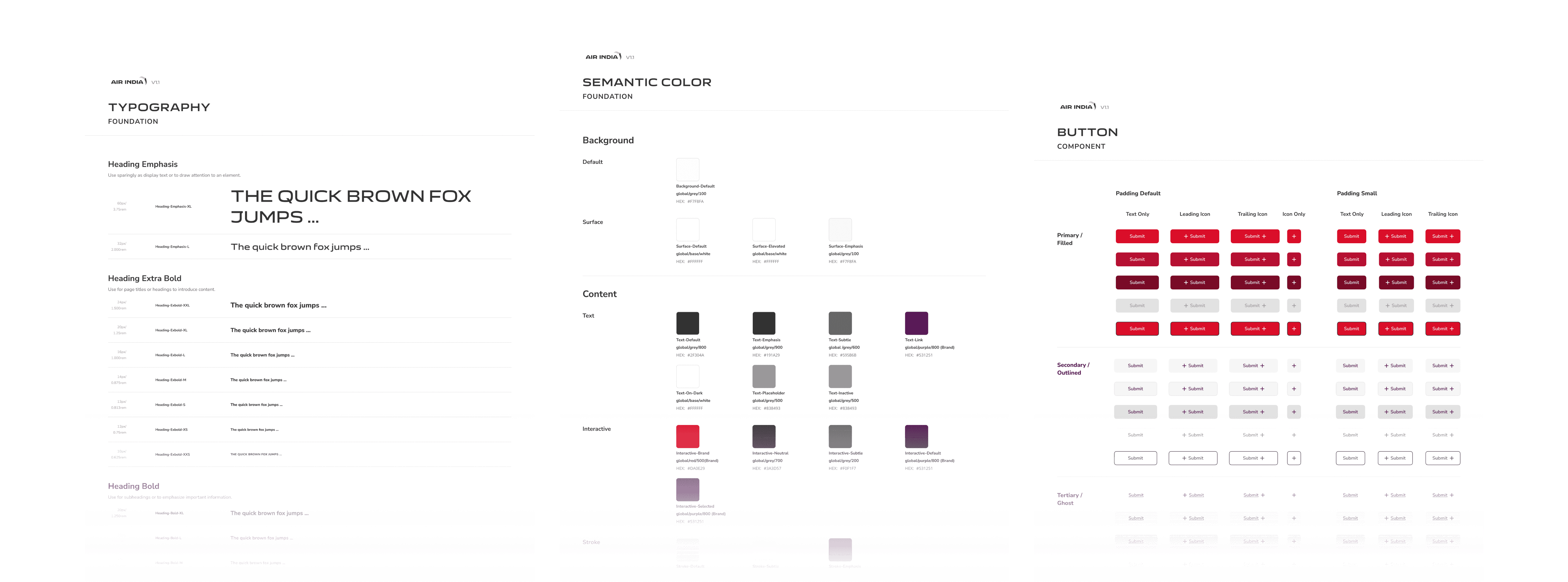
To make the system practical, we started on colors, typography, spacing, grids, and padding. I owned the color work, expanding the existing brand palette with a set of neutrals that would make up the backbone of the design.
Creating a scalable color system
To help reduce decision-making, I implemented primitive and semantic tokens using Figma variables. This would also encourage designers to stick with predefined colors rather than color-picking or making up their own.
Variables
I defined a set of color variables in Figma to standardize the palette across features.

Semantic colors
I decided on the color patterns of common elements such as background and content blocks, which we referred to as “surfaces”

Process highlights
Staying on track
I established a workflow to scale with the design work.
When version 1 of the employee portal was complete, my partner and I carved out time to refine the library systematically. We standardized components that had drifted and revisited existing components to make sure they were scalable and responsive.
Stress-testing components
What happens when a component is used in a mobile context? Would it flex correctly? We tried to answer those questions proactively to ensure components were versatile enough to prevent breakage.
I suggested a branching workflow for version control.
That way, we could iterate without disrupting designers who were actively using the library. Before committing any branch, we’d review each other’s work, stress-test components, and define constraints where needed.

Process highlights
Encouraging guidelines
Because feature demand outpaced our ability to build everything at once, we shipped the system in small increments. We prioritized inconsistencies that were both high-frequency and high-impact, then released bite-sized guidelines the team could adopt quickly.
Most recurring inconsistencies
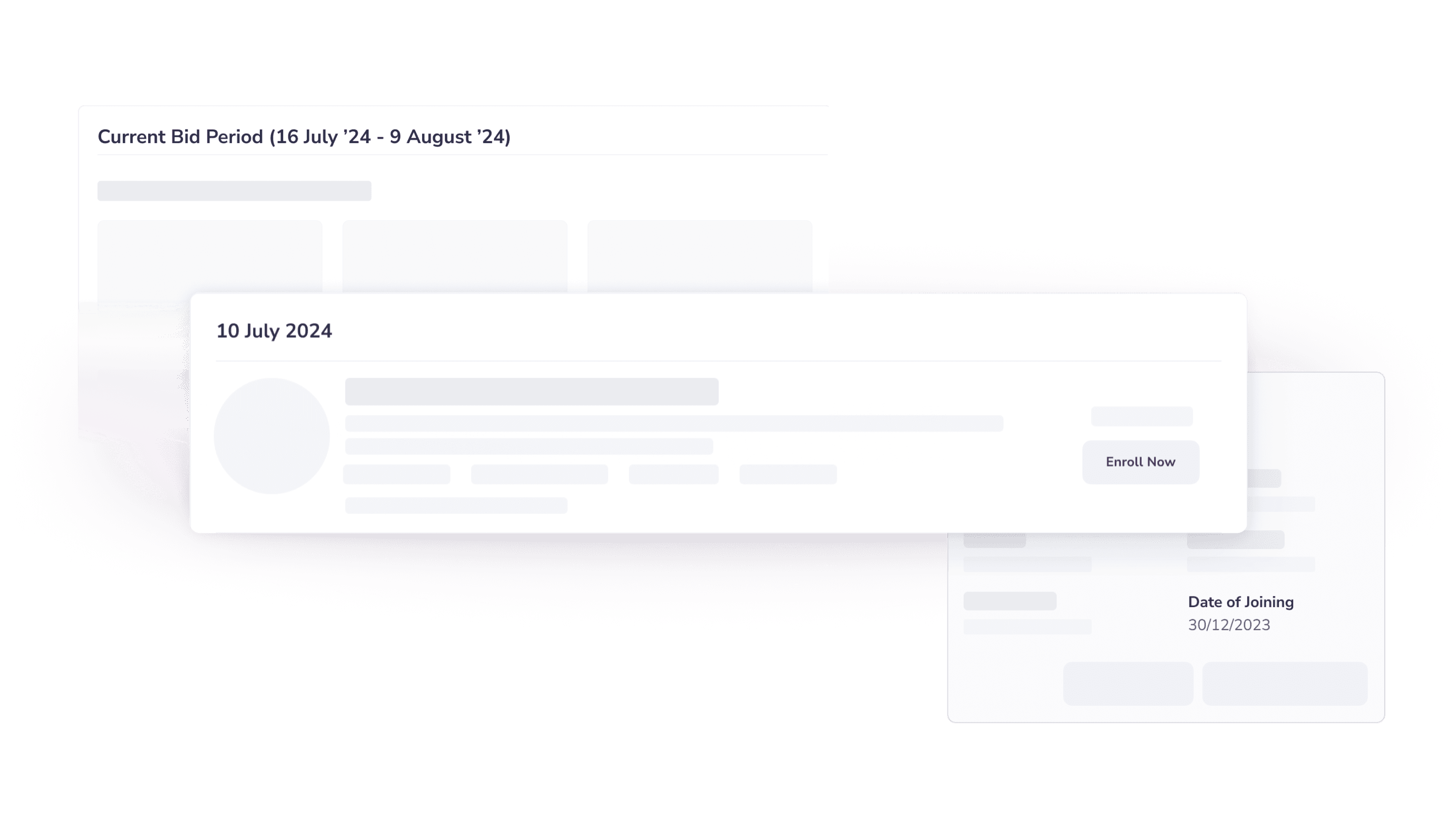
Dates
Copy and formatting varied widely

Tags
Designers detached components to resize and changed padding

Empty states
Mixed visual styles that didn’t cohere
Fighting inconsistency with guidelines
I wrote usage guidelines and presented examples to address these recurring problems and reduce rework. These guidelines were also exported and shared with developers as we continued expanding the design system.

Process highlights
Design system adoption
I advocated for the design system through regular syncs with the team.
Documentation alone wasn’t enough. Every Monday evening, we ran a sync with the India team: what changed, why, and how to use it. This was an open floor for questions and feedback.

Solution
A comprehensive design system to unify 156 tools

Foundations and components, built to scale
Working in parallel with feature design, my teammate and I built a design system from the ground up:
Design foundations
Color variables (primitive and semantic), typography, elevation, grid, icons, spacing, and corner radius
Component library
100+ components and variants with usage documentation, examples, and specs
Quick-win guidelines
Addressed high-impact inconsistencies (date formats, tags, empty states) through bite-sized releases
Driving adoption across 9+ designers
To ensure successful adoption, I had conversations with the design team to understand their workflow needs, created detailed documentation for component usage, and established feedback loops to continuously iterate on the library based on real-world designer needs.
Reflections
What I'd do differently


Let's grow together
Need a versatile and scrappy designer on your team? Send me a note at joanneux.design@gmail.com
(✿◡‿◡)