
At a glance
Overview
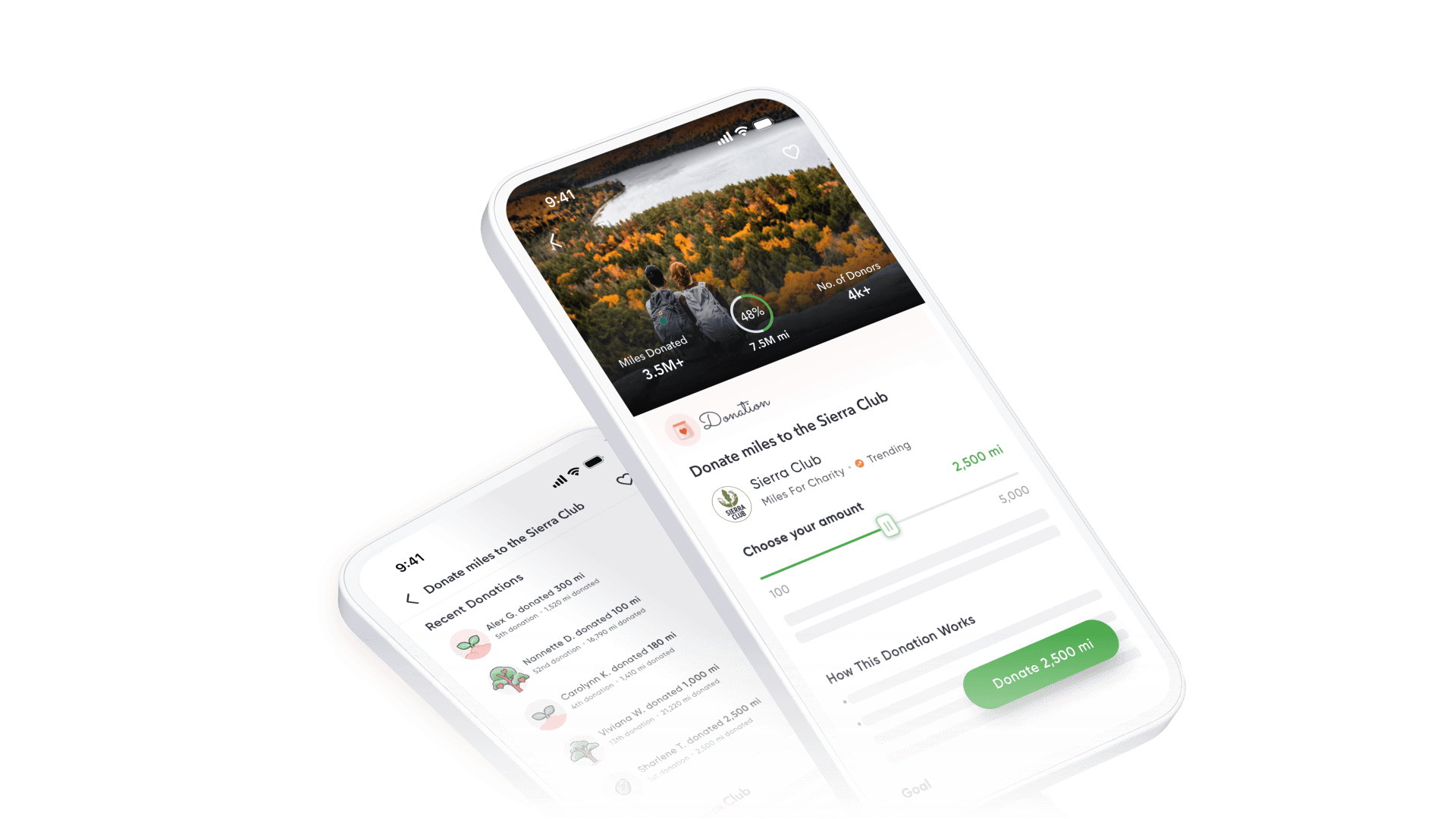
Miles was a mobile app that converted miles traveled into points, which were redeemable for various rewards with brands like Amazon and Sunbasket. During the pandemic, the company was forced to rethink ways to earn and redeem points. The introduction of charity campaigns was one of these efforts.
Problem
Charity campaigns were retrofitted into a template for redeeming loyalty points. The lack of a specialized donation platform meant the need for manual content updates from Marketing and Design teams.
Solution
I designed a customized donation template for charity campaigns, integrating dynamic content into the app to eliminate custom work from internal teams.

Impact
Challenge
How might we improve a donation experience that was retrofitted into a loyalty and rewards app?
Context
Scaling with a makeshift solution
Retrofitting charity campaigns to fit the existing platform was a quick solution to launch donations on the Miles app. However, this came with a few issues affecting both users and the marketing team.
The template retains terminology related to point redemption.
Words such such as “pay” and “redeem” don’t make sense in a donation context.
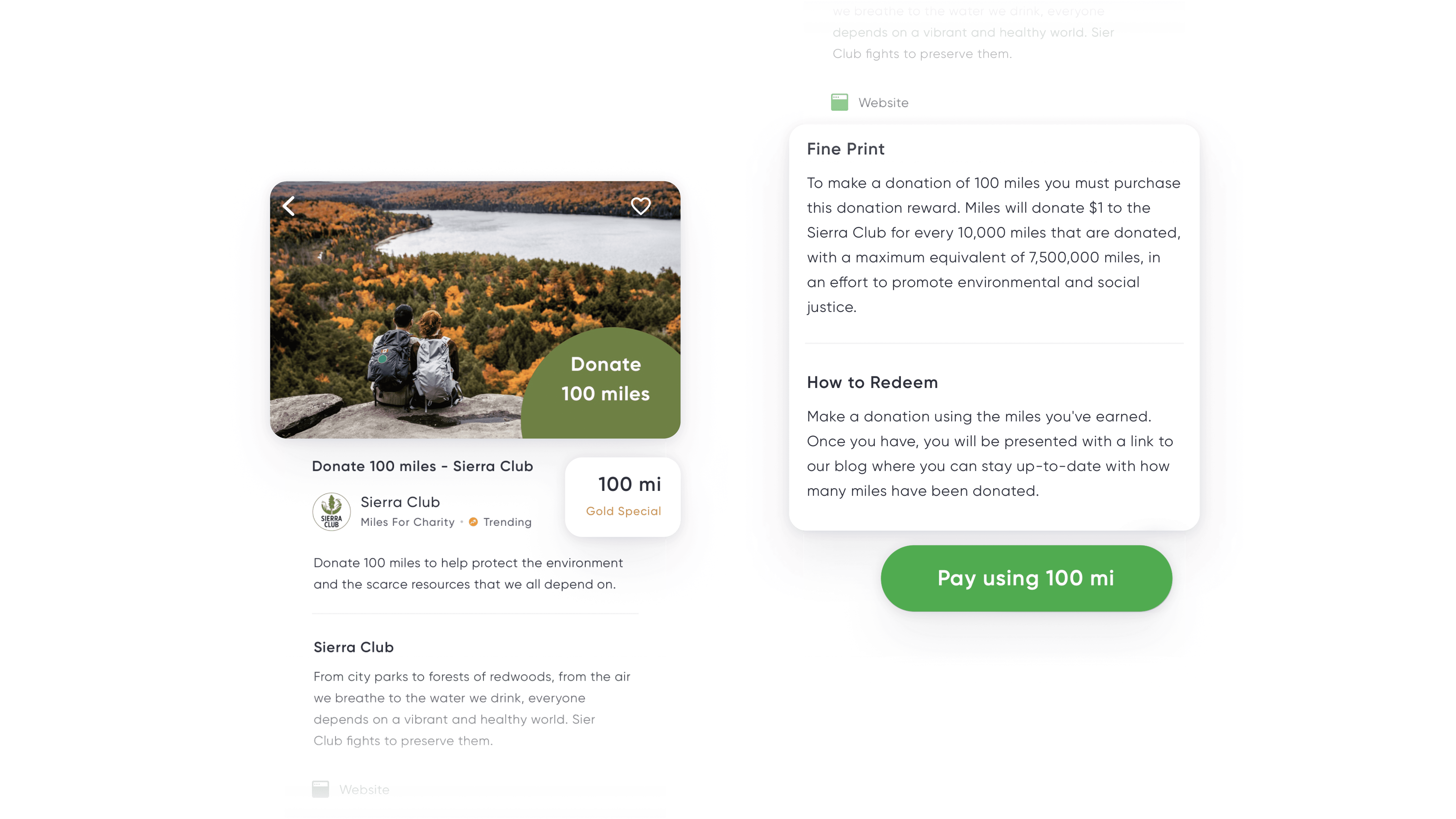
The current system was cluttered and limited in options for donation amounts.
Each donation amount has a separate listing per charity campaign, which lacked logical grouping when viewed in a list.

Pain Point
Preset donation values only
Donation amounts were strictly set by the Marketing team, which meant no flexibility for users who were off by a few miles
Pain Point
Inefficient use of space
Every campaign had multiple listings for different donation denominations.
Pain Point
Ungrouped listings
Donation values for the same charities were ungrouped, meaning the user would need to scroll around to find the correct campaign and donation amount.
Internally, the marketing team needed to write copy and create graphics for each charity campaign.
The marketing team used an external blog to post the updates, while the in-app receipt was generic and lacked any relevant charity info.

Process highlights
Initial research
I set the bar with competitive analysis.
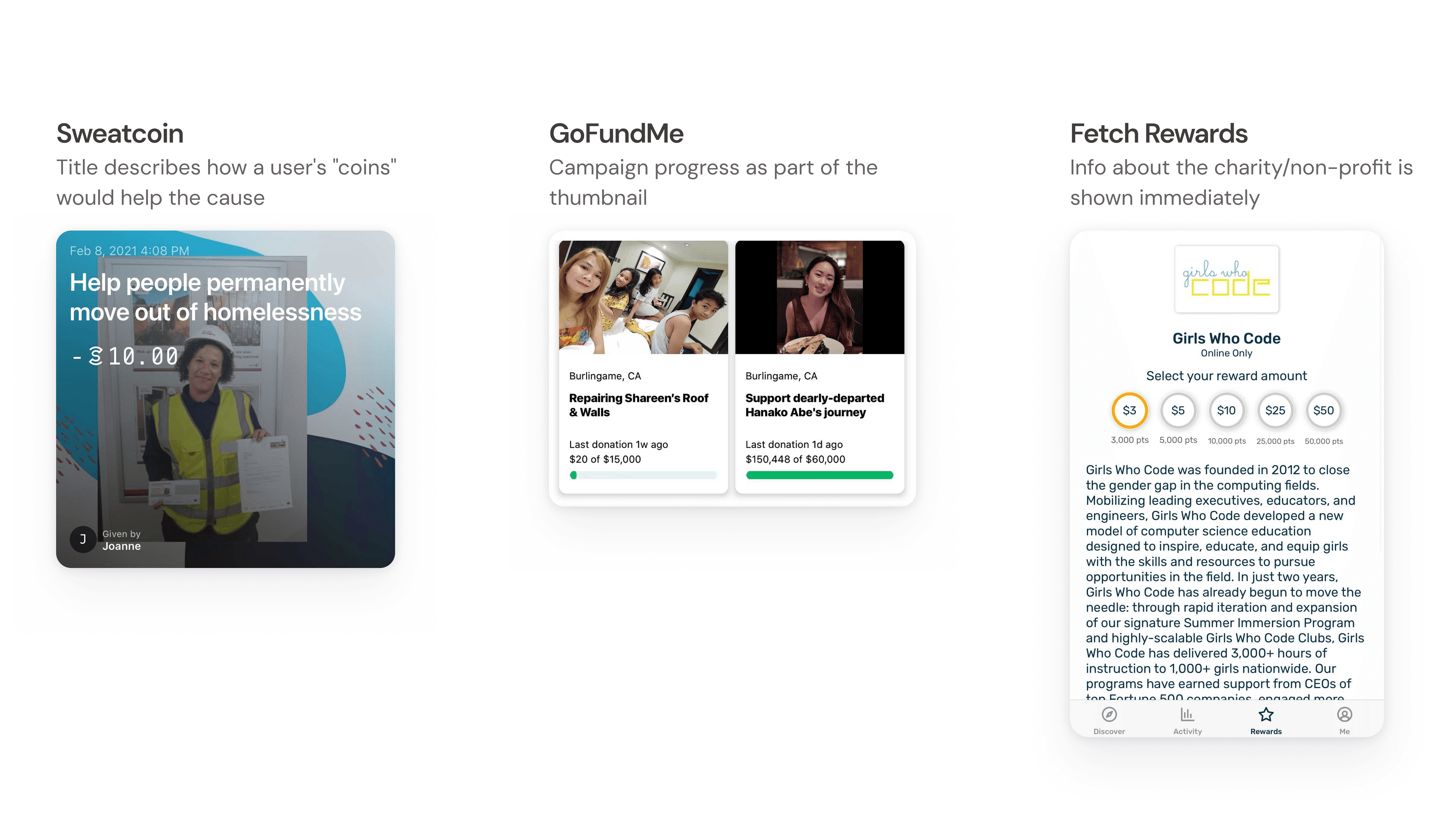
I looked at Sweatcoin, Drop, and Fetch Rewards, as well as GoFundMe, to see existing standards for donation platforms. I found that I could more easily compare platforms by mapping each app’s flow into basic steps of a donation process.

The donation journey

User feedback revealed a lack of clarity on donation instructions and implications.
I obtained app feedback from users to find useful tidbits regarding the donation experience and grouped similar topics together.

Process highlights
Turning research into action
I ideated solutions with a How Might We exercise.
I distilled problems discovered during the research phase into questions I could answer by considering how competitors were handling donations.
Question 1
How might we create a better learning experience?
I found that there was a lack of clarity in how donated Miles would translate to a charity contribution. Competitors solved this problem by being as descriptive as possible upfront.
Question 2
How might we offer more options for donors?
I aimed to create an experience that would allow for flexibility in donation value, while also removing the hassle of scrolling to find the right denomination.

Idea
Use preset values the user can select from
Offer preset values the user can select from to reduce cognitive load
Idea
Let the user enter miles manually
With an input field, the user would have the freedom to donate as little or as many points as they choose
Idea
Selection with a dial or slider*
Use an unconventional control, such as a dial or slider to give the user flexible to select miles
Question 3
How might we improve the post-donation experience?
My goal here was to motivate the user and make them feel good after donating.

Idea
Show gratitude
Thank the user for their donation with a simple message and confirmation that the donation went through
Idea
Display a progress bar
Showing how many people have donated could help motivate the user by making them feel like a part of a larger community
Idea
Give an option to leave a name
A user may want to show their name and donation amount on a social feed to feel gratified for doing something good
Insight
Based on GoFundMe's tried-and-true approach, I made an assumption that the social aspect of leaving your name and message on a feed gives users a sense of satisfaction after donating. This led me to explore options surrounding these ideas.
Highlights
Hi-fi explorations

The existing reward template was a design constraint.
Stakeholders wanted to ensure that the experience wouldn’t feel too different from what was already in place, so there was a challenge to integrate the new donation elements without moving too much around.

Change 1
Showing campaign progress
In my competitive research, I found that the campaign progress bar is an essential part of a charity campaign. It was important to highlight this information and make it accessible. I made the call to overlay the numbers on top of the Reward Image to save space on the rest of the screen. This was also ideal for maintaining the screen structure as is.

Change 2
Choosing a donation amount
Stakeholders requested a more unique experience by using a slider, which was not a pattern I’d seen in my research. Furthermore, addressing precision was a major challenge.

In the end, we came to a compromise with the slider by using changing increments as the user slides through larger or smaller values. The minimum amount would be a consistent value, while the maximum amount is a set value OR the user’s miles, if it is less.

Change 3
Integrating a social feed
As I explored ideas for a social feed, stakeholders saw an opportunity to add elements of gamification. I came up with the idea that we could use badges to indicate a user’s donation “experience.”


Change 4
Donation receipt and next steps
I expanded on the ideas used for the social feed to be consistent with the gamified experience. However, I found that the these elements were taking away from important charity information.

Solution
A more custom donation experience
I combined common donation patterns with the current structure.
I wanted users have a familiarity with the experience by following existing donation patterns. At the same time, new ideas like user badges and a slider interaction add a fresh spin on things.
Smoother donation flow with clarified details
With a slider, the user can select the amount of points they’d like to donate. Information about the charity are at the forefront, with campaign progress displayed at the top. Details on how points are converted to USD are clarified in the fine print to keep users fully informed.
Upgraded receipt
Rather than a generic “purchase” screen, the receipt now displays points spent as well as the current status of the campaign. The CTA links to the non-profit’s website if the user wants to learn more about the cause.
Reflections
What I learned
Pushing back on experimental ideas
Making a slider work was an interesting thought exercise, but the incremental value rules were opaque, while the physical act of sliding across a small screen could lead to user frustration. A simpler solution would've been to combine the input field for flexibility and preset values to prevent decision fatigue. But I'd have to validate that, for sure!
Validating my assumptions
I made a lot of assumptions while designing the donation feature, such as the fact that users only make donations based on the info presented to them on an app. If I had another shot at this, I would like to validate my hunches and explore other pivotal points in the user journey.
Let's grow together
Need a versatile and scrappy designer on your team? Send me a note at joanneux.design@gmail.com
(✿◡‿◡)