

At a glance
Overview
DGCA (India’s aviation authority) requires pilots to file a detailed report after every flight with data on crew, timing, fuel, landing details, crew log shifts, remarks.
Problem
Pilots filled reports by hand (including manual calculations), and a data operations team transcribed them into an online portal. This created double work, delayed data, and introduced avoidable errors.
Solution
I led the end-to-end design of an iPad app that cut completion time from 20 minutes to 5, and delivered same-day reporting data.

Impact
4x
faster to complete the report
1,000+
pilot work hours saved
85%
rated as easier to use
Challenge
How might we design a digital flight report that a tired pilot can complete accurately in minutes?
Context
Why design a pilot app?
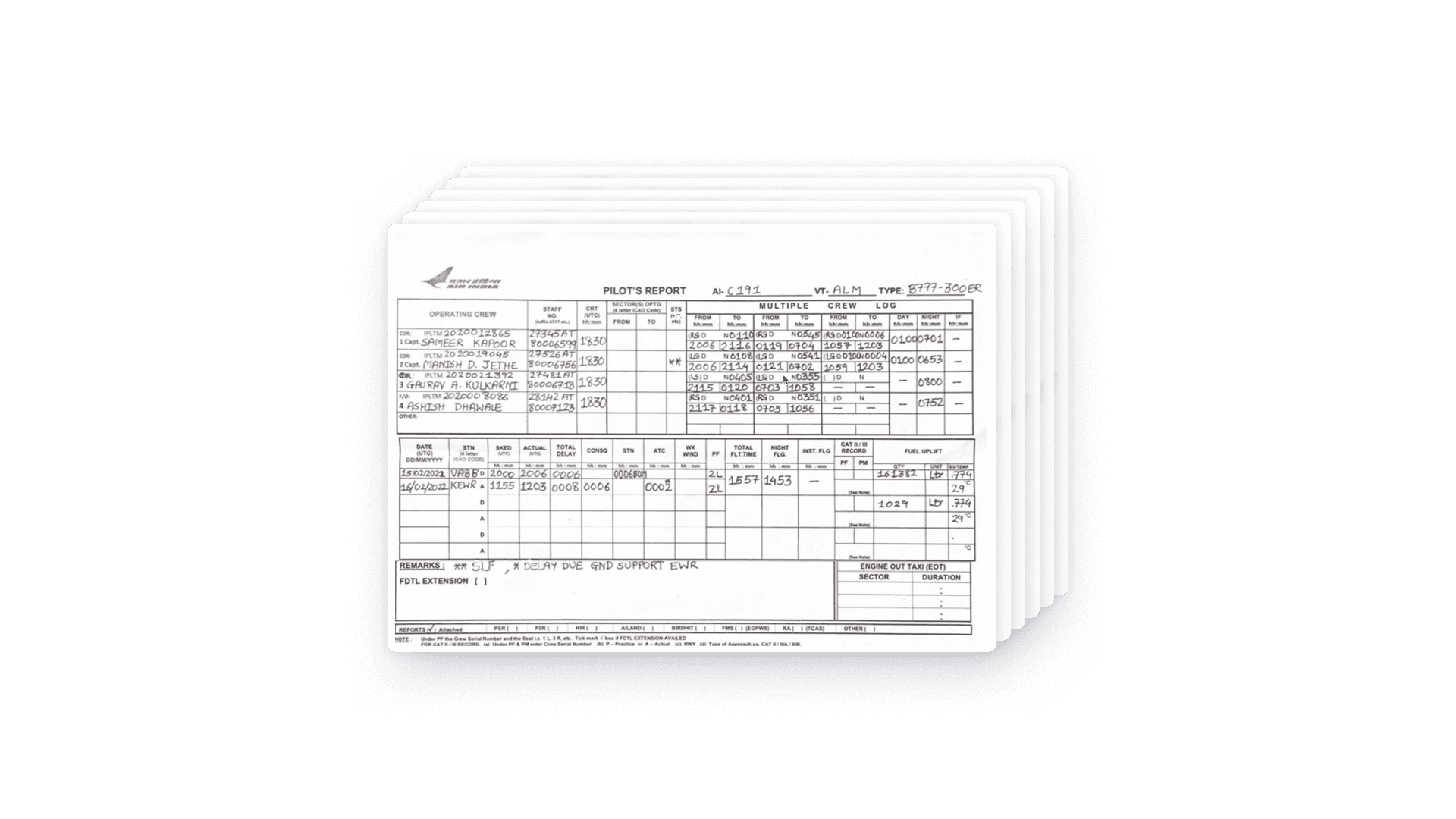
Pilots file 1,000+ flight reports by hand daily.
Pain Point
Manual calculations at scale
Pilots were calculating fuel and work hours by hand after flights, which was time-consuming and mentally taxing after a long day.
Pain Point
Double data entry
Operations teams manually transcribed each report into a portal. This added a 4-day lag and introduced transcription errors.
These pain points opened up opportunities for improvement: it was clear that digitization could eliminate redundant work, reduce errors, and accelerate the reporting pipeline, creating value for pilots, operations teams, and the business.
Approach
Process overview
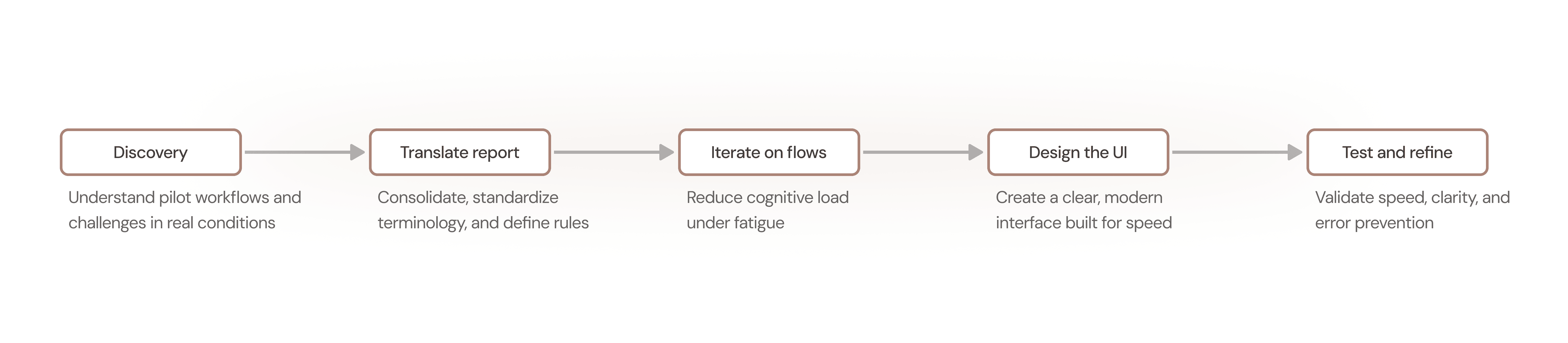
We set out to build an MVP that focused on the core issues.
A new head of technology brought together a small team: my manager and me, a lead developer, and two pilot consultants (both first captains). Our v1 goals were simple:
Goal
Make it easier for pilots to fill out the report
Success criteria: Measure time spent filling out the report on the new app and compare against time spent on the paper report.
Goal
Reduce friction uploading reports into the database
Success criteria: Measure time spent sending the data to Air India's operations team.
What I learned
Discovery & research
At the beginning we received two types of paper reports filled by pilots. These reports fell into two categories: Boeing vs. Airbus, but we weren’t clear on the major differences.

We learned two major reporting contexts for pilots.
I conducted contextual interviews with the pilot consultants to understand the reports, their workflows, pain points, and the cockpit environment. We learned that there were largely two different types of pilots at Air India. This aligned with our starting point of two reports, which are used by each pilot type:

Long-haul pilot (Boeing)
Large, wide-body aircraft
Single flight per day
Needs to schedule and log rest times


Short-haul pilot (Airbus)
Smaller, narrow-body aircraft
3-4 shorter flights
Several reports to file per day

Despite the differences in work hours, both of the pilot consultants expressed feeling tired post-flight, due to scheduling or time zones changes.
Process
Key design decisions
Decision 1
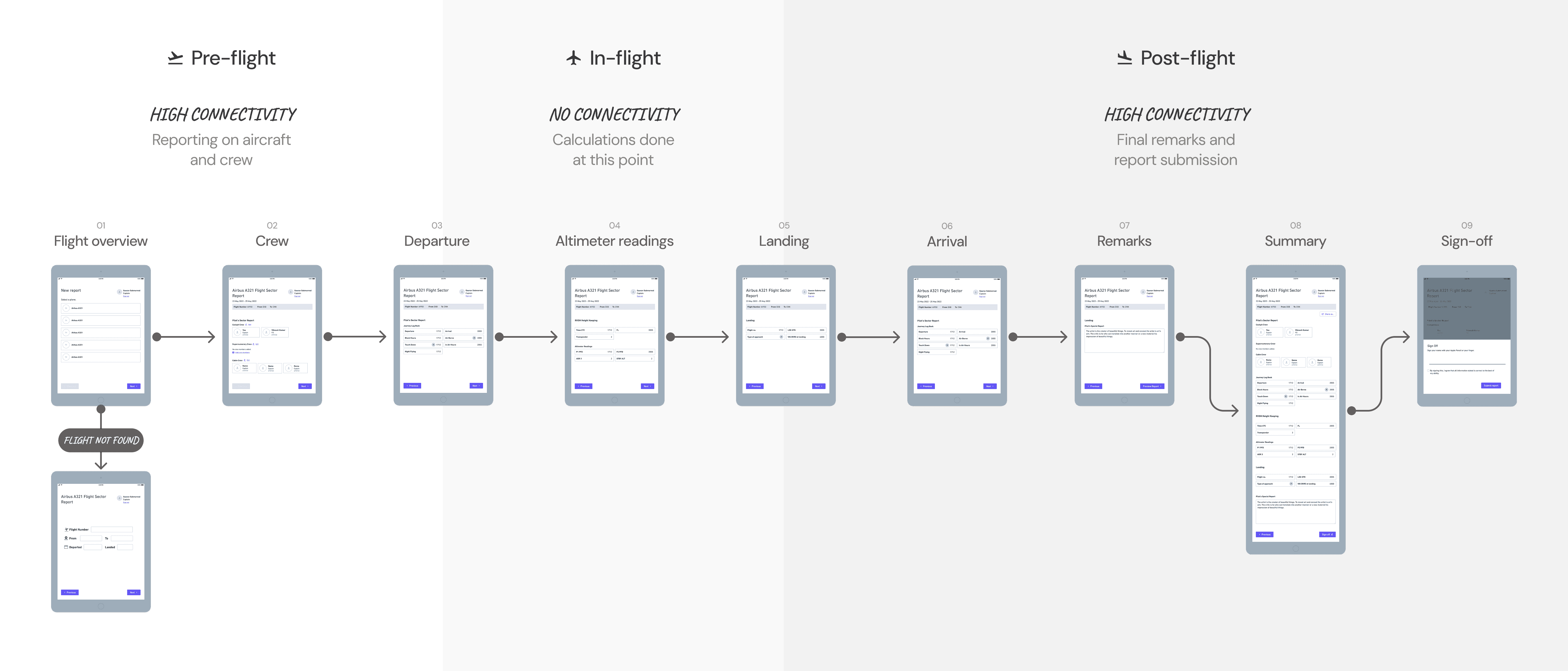
Break the report into steps
Pilots described the report as a sequence of tasks. When tired, seeing everything at once increased scanning and re-checking.
Decision 2
One section per screen
I explored two interaction models: the entire report on one screen and one section per screen. Pilots preferred decoupled sections. It reduced visual complexity and helped them focus on one task at a time.
Op 1
Entire report on one screen
We presented a screen with flight hours, departure/arrival, and crew on the same screen.

check
Op 2
Single section per screen
We showed an example of one section per screen, where crew and departure/arrival times are separated.

Synthesis
From paper → digital
The core work was translating a paper artifact into a product that could be completed reliably under by tired pilots while maintaining accuracy and without breaking compliance.
Step 1
Consolidate two legacy reports
One of my first tasks was consolidate the two original paper reports into a single system by mapping overlapping fields with different labels, aircraft-specific differences, and what was truly required vs. legacy artifacts.

Step 2
Turn “fields” into rules
The paper form didn't communicate any sort of logic, which was hidden in the pilots' heads. The digital version needed explicit rules.
Auto-calculation rules
We collaborated with the pilots and devs to design for total fuel calculation, a task previously done manually.
Conditional logic
We worked through the pilots' internal logic, showing/hiding landing fields based on prior inputs.
Validation constraints
Time-based inputs like pilot shifts in the Crew Log needed validation.

Step 3
Optimize for less data entry
The paper workflow treated pilots like data entry. In the app, we wanted to make it less tedious, reducing data entry where possible. The system pre-fills what it knows, then the pilot verifies and edits exceptions.
Data verification, not data entry
Flight details could be easily accessed with an internet connection, allowing the pilot to coast through details they would normally have to fill out.

Process
Visual design
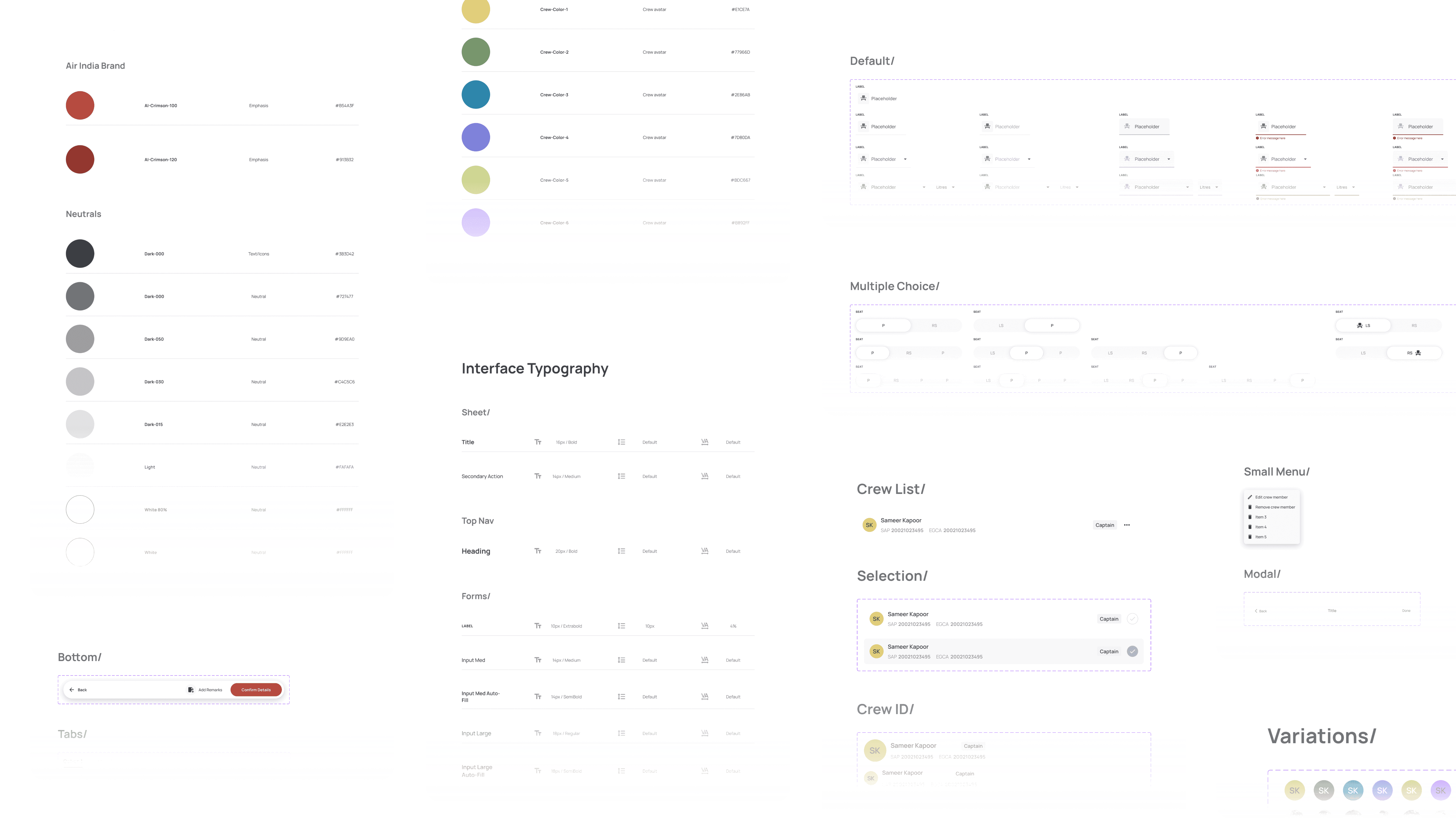
I built a design system that aligned with our core tenet of simplicity.
This project was zero-to-one: we designed the entire app experience, and I led the visual direction. I also built and maintained the Figma library for the app (components, typography, spacing, states, and interaction patterns).
Iterations
Testing and refinement
We tested 6 pilots to complete a report using the app.
With the first release, we asked the pilots to record themselves completing a real report. Completion time dropped from 20 minutes to 5.

Videos showed pilots hesitating at certain points—but why?
Upon closer observation of the videos, I noticed that pilots would pause at moments that seemed to signal issues with tappability and weak affordances. I iterated on:
Clearer interactive states and checkbox visibility
Some elements didn't look obviously interactive, like the cards in the Add Crew screen. I added a border around each crew member on the list, as well as a border on the checkbox.
Input field affordance
I originally designed input fields with a minimal line design to keep the screen as clean as possible. We found that the single line didn't always offer an obvious affordance, so I updated the component to look like a standard text field.
Solution
Digitized and streamlined
The iPad reporting app streamlined reporting while maintaining regulatory compliance by combining pre-filled data and automated calculations.
Searchable flight and crew databases reduce repetitive entries and transcription errors.
Instead of manual crew entry, the app pulled from scheduling systems to pre-populate crew data. Pilots primarily verified and edited exceptions.
Automated calculations remove mental calculations and mental load.
Fuel and crew-log screens embedded formulas and logic to eliminate manual math.
Digital inputs make for easy upload.
An internet connection allows for immediate delivery of the pilot report online, rendering transcription redundant.

Let's grow together
Need a versatile and scrappy designer on your team? Send me a note at joanneux.design@gmail.com
(✿◡‿◡)